Foodlify checkout on an iPhone, with the order summary, itemised price summary and the Choose payment method button

Project overview

TL;DR

In Foodlify V1, people re-entered their card details on every order. For V2 I rebuilt checkout around three moves: show the full order and price before asking for money, offer a pre-funded wallet as the first way to pay, and confirm the exact deduction before it happens.

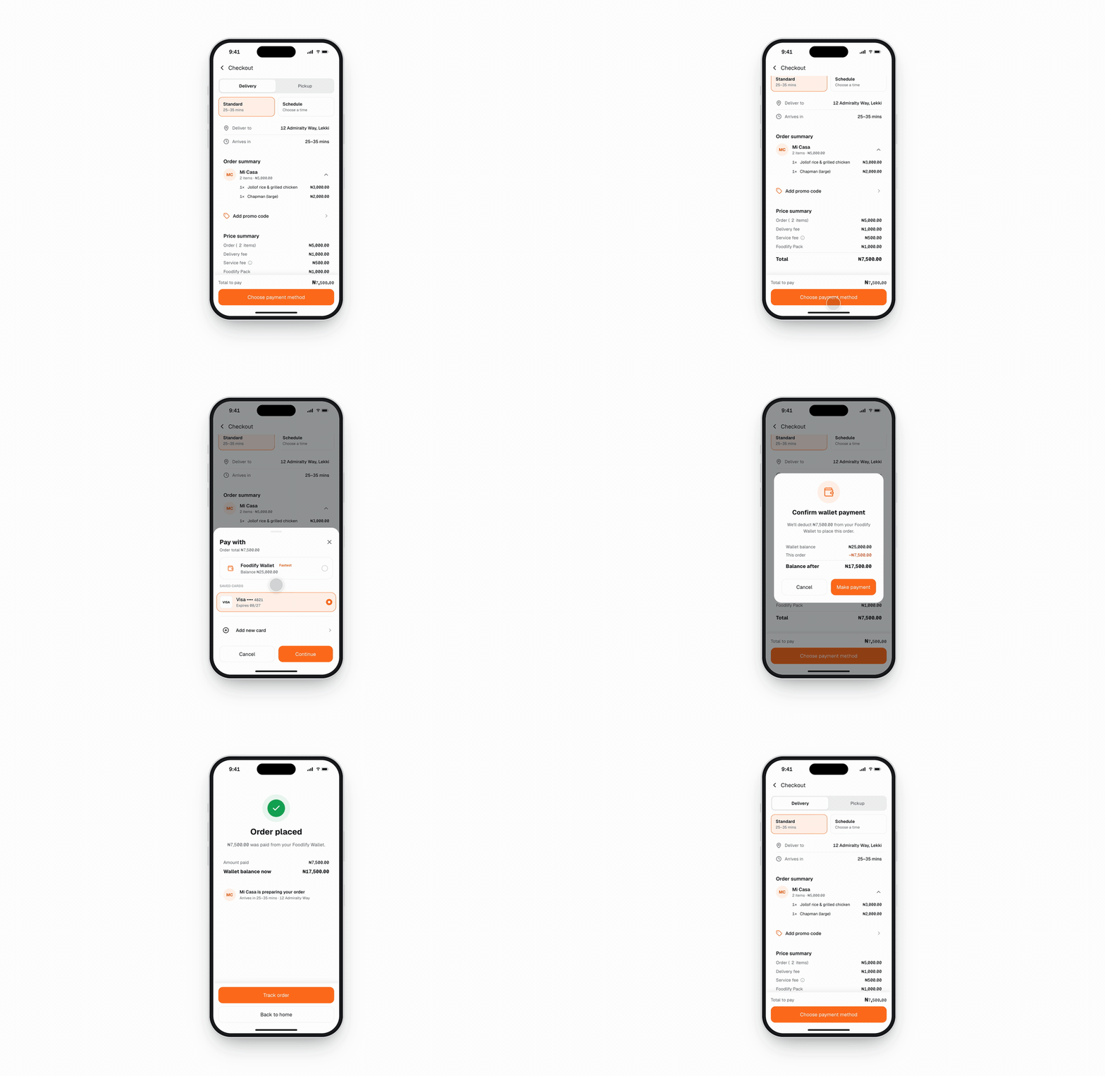
Four checkout screens: the itemised order review, the payment sheet with the wallet first, the wallet payment confirmation, and the low-balance state
Left to right: the order review with every fee itemized, the payment sheet with the wallet and its balance listed first, and the confirmation that states the amount before it is deducted.

The problem: every order started with a card form

Foodlify is an all-in-one delivery app for meals, groceries, medicine and household items. In V1, checkout was one of the flows people found hard to follow, and it asked for card details on every transaction: the same card number, expiry date and security code, each time someone ordered.

So the question for V2 wasn't how to make the card form nicer. It was how to stop asking for it.

V1 checkout: the order summary, an empty card form, the card being typed in again, and a bank OTP screen
V1 asked for the full card on every order. In V2, a funded wallet turns that form into a single choice.

Decision 1: Make the wallet the first way to pay

In the V2 payment sheet, the wallet sits first, with its current balance beside it. Card and Add new card stay below it as alternatives.

A funded wallet replaces card entry at checkout with one tap. Showing the balance inside the sheet means people can see whether it covers the order before they choose it, rather than finding out after. Card stays available so a first-time customer, or anyone whose wallet is empty, can still pay.

The trade-off is that a wallet moves the effort rather than removing it: someone has to load it first.

Wallet as first option: the itemised order review and the payment sheet with the Foodlify Wallet pinned first and its balance shown

Decision 2: Confirm the amount before it leaves the wallet

Paying from the wallet ends in a confirmation that states exactly how much will be deducted, with Cancel and Make payment side by side.

It puts a tap back into a flow built to remove steps. What that tap buys is a last look at the exact amount, from the method the person chose, before any money moves.

Confirm wallet payment dialog showing the wallet balance, the order amount and the balance after
Each step answers one question: what am I paying for, how will I pay, and is this the amount I expect.

Edge cases

Checkout trust is built in the failure cases, so every money state answers "did money move?" in its first sentence.

  • Low balance. Each direction answers this its own way. A offers to top up the shortfall and pre-selects the saved card. B offers an exact top-up. C splits the payment between wallet and card automatically. D turns the button into "Top up & pay".
  • Processing. The amount and source stay on screen while the payment runs, and the button locks to prevent a double charge.
  • Payment failed. The screen says plainly that nothing was deducted and shows the unchanged balance. It offers Try again or Pay with card instead, with a support reference.
  • Invalid promo code. The error sits next to the field with the reason (for example, the code expired on 30 Sep), and the price summary visibly stays at ₦7,500.00.
  • Service fee. The tip explains the flat ₦500 and its share of the order.
Low balance: the payment sheet shows the shortfall with a one-tap top-up and pre-selects the saved card

The result

Foodlify V2 is in private beta, with more than 20 users ordering from more than 10 vendors.

  • Card re-entry is gone. Users pay from their wallet balance or a saved card, so no order starts with typing card details.
  • Ordering got simpler. The redesigned order and checkout flow simplified the ordering process and led to higher engagement than V1.
  • Users noticed. Beta users have given positive feedback compared to the previous version, especially on the cleaner interface.